A redesigned review flow that helped all tested reviewers understand the core structure without assistance.
Product Designer
1 quarter
Product Owner, 2 Engineers, QA, UXR
why?
At Elsevier, we needed to combine two pilot platforms for peer review into a new UI that supported the functionality of both.
impact
100% of participants understood the four-tab structure without help.
something unexpected
This was my first experience using AI for prototyping for a larger piece of work and I was shocked at how fun and useful it was for communicating ideas to the squad. It felt fresh and novel to use a technology outside of Figma, but I hit a few speed bumps along the way I'll cover in this case study.
Twoplatforms,oneclearerreviewexperience
howreviewswork….
At Elsevier, I was asked to bring two peer-review platforms into one cohesive experience.
Both products supported researchers completing a round of peer review, but each solved a different part of the problem.
Online Peer Review (OPR) gave reviewers an interactive manuscript, in-context annotations, and a quicker route through the review. Its browser-based experience helped make reviewing more efficient and contributed to a 7% increase in revenue. However, it relied on third-party administration and a codebase that could not scale reliably.
New Peer Review Experience (NPRE) was the more scalable foundation. It had a stronger technical base and a simpler entry point for new reviewers, but it relied on PDF downloads and lacked the interactive manuscript experience that made OPR valuable.
The opportunity was not to start again. It was to build on NPRE’s scalable foundation while restoring the parts of OPR that helped reviewers work efficiently and confidently.
At Elsevier, I was asked to bring two peer-review platforms into one cohesive experience.
Both products supported researchers completing a round of peer review, but each solved a different part of the problem.
Online Peer Review (OPR) gave reviewers an interactive manuscript, in-context annotations, and a quicker route through the review. Its browser-based experience helped make reviewing more efficient and contributed to a 7% increase in revenue. However, it relied on third-party administration and a codebase that could not scale reliably.
New Peer Review Experience (NPRE) was the more scalable foundation. It had a stronger technical base and a simpler entry point for new reviewers, but it relied on PDF downloads and lacked the interactive manuscript experience that made OPR valuable.
The opportunity was not to start again. It was to build on NPRE’s scalable foundation while restoring the parts of OPR that helped reviewers work efficiently and confidently.
OnlinePeerReview(OPR)
Access the manuscript in the browser
Interactive (HTML) manuscript
Comments directly on manuscript
Couldn't scale (relied on 3rd party admins)
Poor quality code base
NewPeerReviewExperience(NPRE)
Access the manuscript as a PDF download
Scalable and solid code base
Easier user flow for new users
No interactive manuscript means it takes longer to approve a manuscript
The product needed to balance four things
A scalable technical platform
An interactive in-browser manuscript
Flexible ways to leave feedback
A clearer sense of progress and next steps
The product needed to balance four things
A scalable technical platform
An interactive in-browser manuscript
Flexible ways to leave feedback
A clearer sense of progress and next steps
Researchinsights
whatwasmakingpeerreviewdifficult
Peer review is an infrequent, high-stakes task. Reviewers can go weeks or months without returning to a manuscript, so the experience needs to help them regain context quickly and understand what is expected of them.
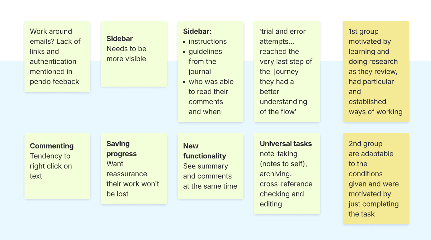
I reviewed earlier interview reports, usability research, UMUX feedback, and support themes from both existing platforms. Across those sources, four insights stood out.
Peer review is an infrequent, high-stakes task. Reviewers can go weeks or months without returning to a manuscript, so the experience needs to help them regain context quickly and understand what is expected of them.
I reviewed earlier interview reports, usability research, UMUX feedback, and support themes from both existing platforms. Across those sources, four insights stood out.
1.reviewersneededcontextbeforetheycouldact
Returning reviewers often needed to reorient themselves before they felt ready to begin. They needed a reminder of the manuscript, the review status, the due date, and the actions still available to them.
Returning reviewers often needed to reorient themselves before they felt ready to begin. They needed a reminder of the manuscript, the review status, the due date, and the actions still available to them.
2.reviewerswantedtochoosehowtheygavefeedback
Not every reviewer wanted to annotate sentence by sentence. Some preferred long-form comments, some wanted to upload files, and others wanted to combine several methods.
A single prescribed feedback format created friction because it did not reflect how reviewers actually worked.
Not every reviewer wanted to annotate sentence by sentence. Some preferred long-form comments, some wanted to upload files, and others wanted to combine several methods.
A single prescribed feedback format created friction because it did not reflect how reviewers actually worked.
Reviewers struggled to find guidance, author responses, editor communication, and the next step in the flow. In several cases, the functionality existed but was not surfaced where users expected to find it.
Reviewers struggled to find guidance, author responses, editor communication, and the next step in the flow. In several cases, the functionality existed but was not surfaced where users expected to find it.
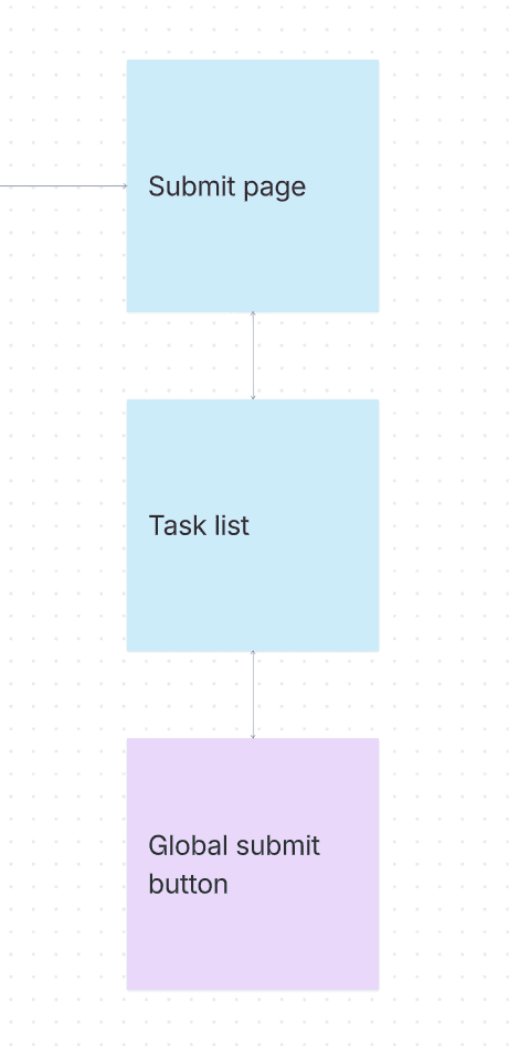
Feedback and support tickets suggested that the global submit button was being mistaken for a general action. Reviewers could submit before they were ready, without a clear sense of what was complete or what would happen next.
Feedback and support tickets suggested that the global submit button was being mistaken for a general action. Reviewers could submit before they were ready, without a clear sense of what was complete or what would happen next.
design&IAdecisions
start with an overview page
Evidence: Reviewers returned after long gaps and lacked the context they needed to begin confidently.
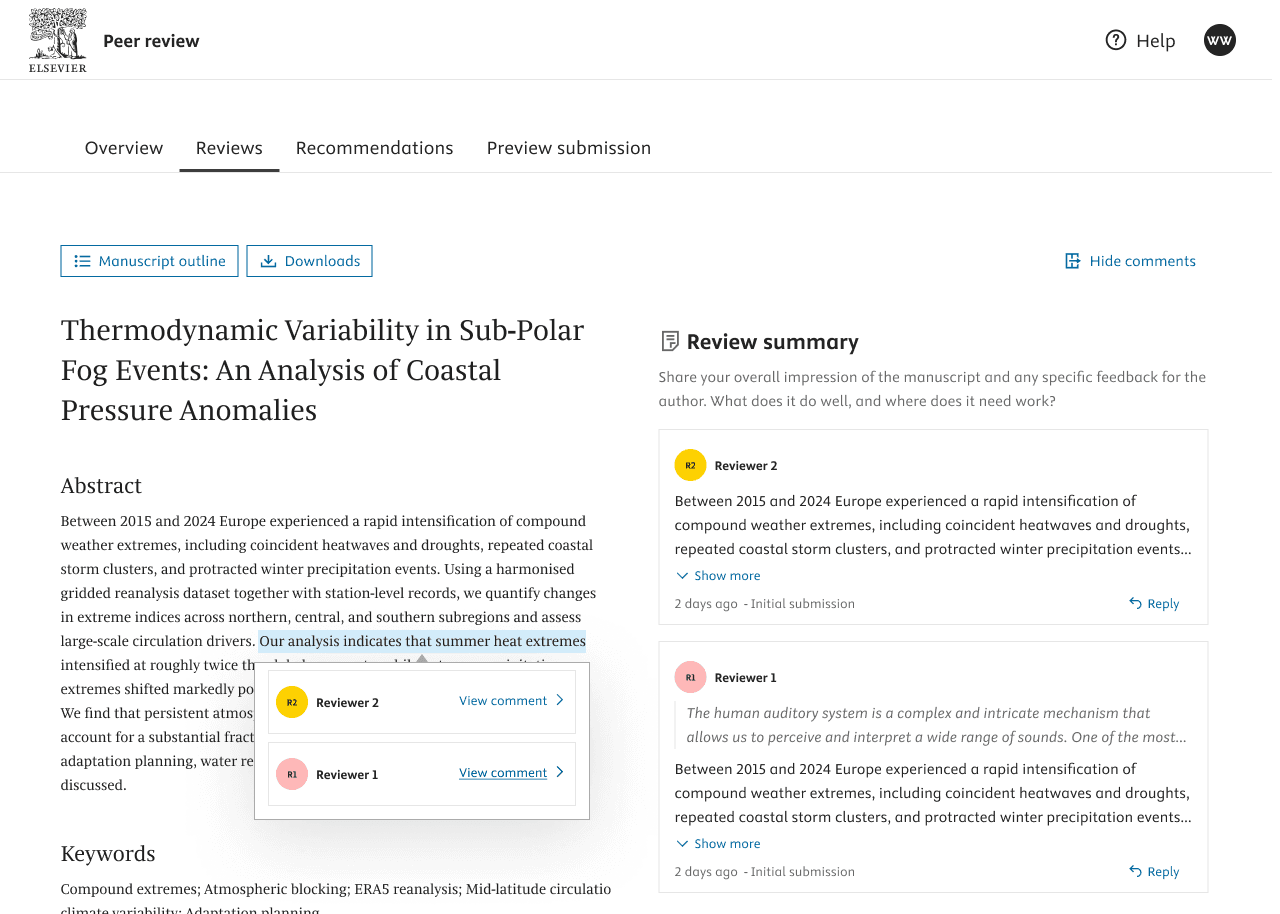
Decision: I added an overview page as the entry point to the review flow. It surfaces the manuscript, status, due date, guidance for first-time reviewers, and the next step in the process.
Why this matters: The page helps reviewers reorient before asking them to act. It also makes the online review path more visible, reducing the chance that someone immediately defaults to downloading a PDF and misses the interactive experience.
Expected behaviour change: Reviewers should understand the purpose and status of the review before choosing how to continue.
bring all reviewer feedback into one place
Evidence: The previous experience separated annotations and summary comments into different views. Reviewers had different preferences and were often forced into a feedback model that did not suit them.
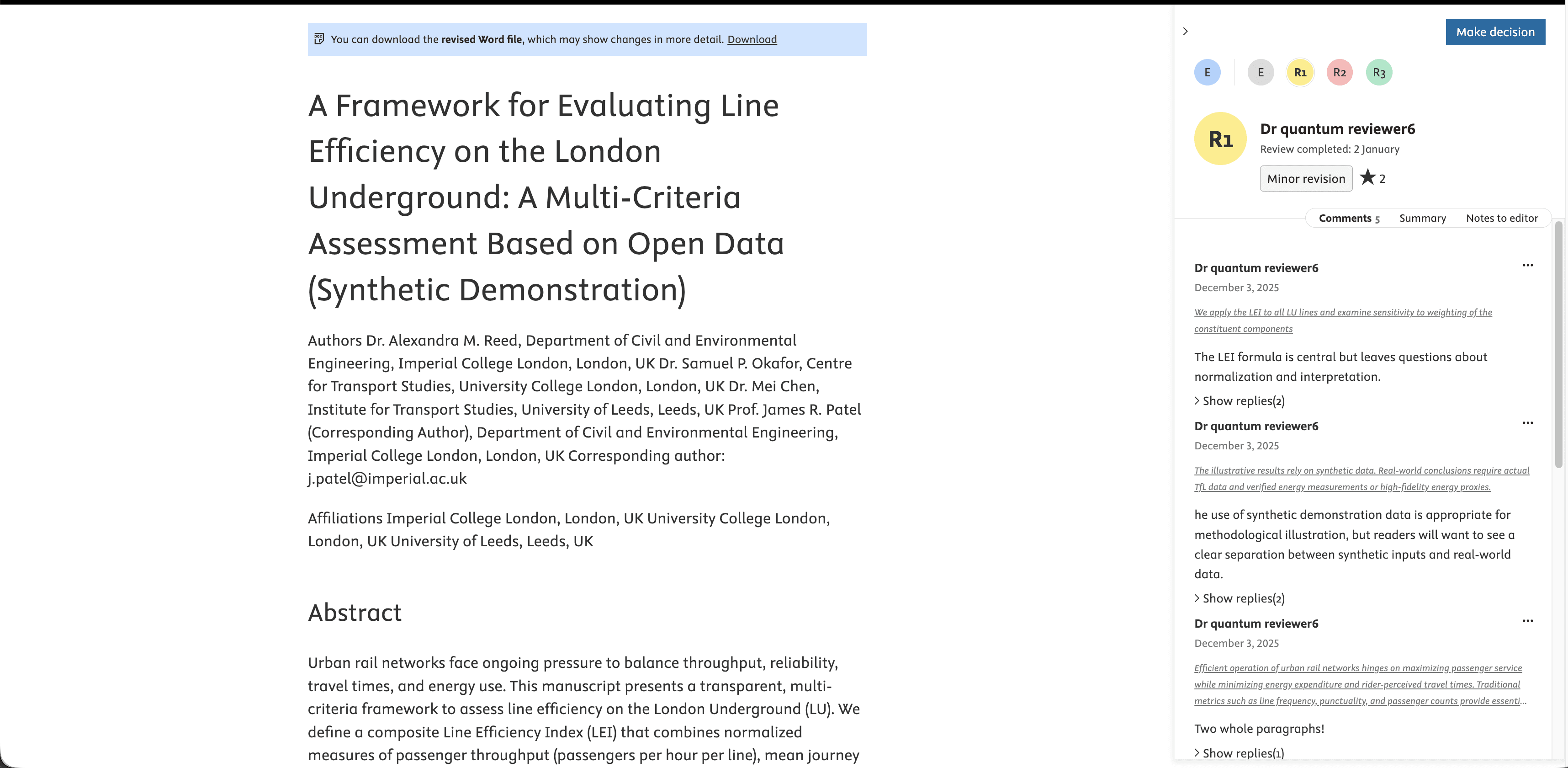
Decision: I created a unified reviews page where annotations, long-form comments, and other feedback can sit together. A lightweight visual cue distinguishes comment types without splitting the reviewer’s own contribution across multiple places.
Why this matters: The experience becomes format-agnostic. Reviewers can work in the way that suits them while still being able to see their feedback as one coherent review.
Expected behaviour change: Reviewers should be able to find, add, and track all of their feedback without needing to understand multiple separate sections of the product.
move notes to the editor beside the recommendation
Evidence: The notes-to-editor field was used by only a small proportion of reviewers, but its content was valuable. It was easy to miss because it lived away from the moment when reviewers were forming their final verdict.
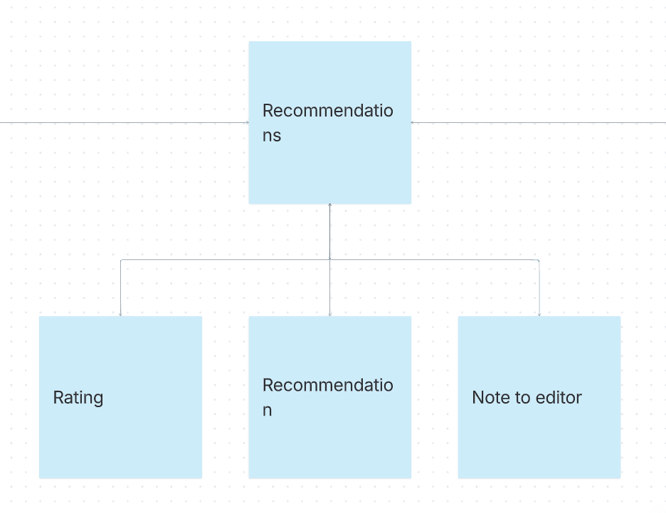
Decision: I moved confidential notes to the editor onto the recommendations page, alongside the rating and recommendation.
Why this matters: The right information should appear at the point a reviewer is deciding what to say. Bringing editor communication into that moment makes its purpose clearer and places it in context for both reviewers and editors.
Expected behaviour change: Reviewers should be more likely to notice and use confidential editor communication when it is relevant.
add a dedicated submission step
Evidence: Reviewers were confused by a global submit control and could mistake it for a routine action rather than the irreversible final step in the review process.
Decision: I added a dedicated “Submit your review” page with a clear explanation of the action and a visible checklist of anything still incomplete.
Why this matters: Submission should feel deliberate. The final step needs to make it clear that changes cannot be made afterwards and give reviewers a final opportunity to check their work.
Expected behaviour change: Reviewers should understand when their review is ready to submit, what remains to be completed, and the consequence of submitting.
4. prototypingandvalidationmethod
Testingthestructurebeforecommittingtobuild
Before committing further engineering investment, I wanted to validate whether the new information architecture made the review flow easier to understand and navigate.
I began with wireframes in Figma, then used Codex to turn the key flows into an interactive prototype using our existing design system. I also provided a written behavioural specification so the prototype reflected the intended interactions rather than only the visual layout.
The prototype was not intended to be a production-ready solution. It was designed to answer a focused question: Could reviewers discover the core review flow and complete key tasks without help?
Before committing further engineering investment, I wanted to validate whether the new information architecture made the review flow easier to understand and navigate.
I began with wireframes in Figma, then used Codex to turn the key flows into an interactive prototype using our existing design system. I also provided a written behavioural specification so the prototype reflected the intended interactions rather than only the visual layout.
The prototype was not intended to be a production-ready solution. It was designed to answer a focused question: Could reviewers discover the core review flow and complete key tasks without help?
wireframe
➡️
interactiveprototype
WhatItested
I ran five individual, moderated usability sessions with reviewers who had between roughly one and twenty years of experience.
I observed whether participants could:
Understand the three-part review structure
Find the different ways to leave feedback
Recognise where to leave a recommendation and note to the editor
Understand the purpose of the rating field
Identify how and when to submit a completed review
Using an interactive prototype meant participants could respond to the experience itself, rather than speculate from static screens. It also allowed the team to test the new IA before committing to a larger build.
I ran five individual, moderated usability sessions with reviewers who had between roughly one and twenty years of experience.
I observed whether participants could:
Understand the three-part review structure
Find the different ways to leave feedback
Recognise where to leave a recommendation and note to the editor
Understand the purpose of the rating field
Identify how and when to submit a completed review
Using an interactive prototype meant participants could respond to the experience itself, rather than speculate from static screens. It also allowed the team to test the new IA before committing to a larger build.
The sessions validated the overall direction of the redesign.
4 out of 4 reviewers who reached the relevant flow understood the three-tab structure without assistance.
The inline manuscript viewer and comment sidebar were especially well received. One participant immediately related the pattern to Word track changes, which provided a familiar mental model for the experience.
Most importantly, the testing did not reveal a need for further structural changes to the core information architecture. The new foundation was understandable enough to continue developing.
The sessions validated the overall direction of the redesign.
4 out of 4 reviewers who reached the relevant flow understood the three-tab structure without assistance.
The inline manuscript viewer and comment sidebar were especially well received. One participant immediately related the pattern to Word track changes, which provided a familiar mental model for the experience.
Most importantly, the testing did not reveal a need for further structural changes to the core information architecture. The new foundation was understandable enough to continue developing.
whatstillneededrefinement
Testing also surfaced three concrete discoverability gaps before additional engineering investment.
Recommendations language did not match reviewer language: The label made sense internally, but did not fully reflect how reviewers described the output they were being asked to provide.
The rating field lacked visible scoring criteria: Reviewers could see the field, but not enough context to know how they should use it consistently.
One participant confused review tabs with leaving the review flow: The structure was largely understood, but the relationship between the in-review navigation and wider product navigation needed to be clearer.
Testing also surfaced three concrete discoverability gaps before additional engineering investment.
Recommendations language did not match reviewer language: The label made sense internally, but did not fully reflect how reviewers described the output they were being asked to provide.
The rating field lacked visible scoring criteria: Reviewers could see the field, but not enough context to know how they should use it consistently.
One participant confused review tabs with leaving the review flow: The structure was largely understood, but the relationship between the in-review navigation and wider product navigation needed to be clearer.
shippeddesigns
lessonsfromAIprototyping
AIhelpedustestearlier
Using Codex made it possible to move from wireframes to an interactive prototype quickly. That gave researchers, product, engineering, QA, and design a more concrete artefact to react to than static screens alone.
It was particularly useful for communicating flow and interaction intent early, when it was still inexpensive to change direction.
It did not replace design craft or team alignment
The prototype also made the limits of the approach clear.
I still returned to Figma to refine details and produce handover notes, which duplicated some work. The polish of an interactive prototype also made it easy for people to assume that certain details were approved for development when they were still exploratory.
The tool accelerated the prototype, but it did not remove the need for clear design ownership, behavioural specification, or team alignment.
WhatIwoulddodifferentlynexttime
Define the prototype’s level of fidelity upfront: Make it explicit whether the work is exploratory, suitable for usability testing, or ready for implementation discussion.
Agree on a source of truth: Decide early where interaction rules, detailed design decisions, and handover guidance will live so work is not recreated across tools.
Separate validated direction from build commitment: Review prototypes with product and engineering as a team, clearly identifying what has been tested, what remains open, and what is not yet intended for development.
AI prototyping was most valuable when used as a way to learn faster, not as a replacement for design process, collaboration, or careful handoff.